
Thursday, 7 May 2015


Book Cover Design Process

Graph paper also used for the double page spread is now given a new lease of life as the spine, tying the recipe pages and the covers together.

Typewriter style font is used, interjected with handwritten font to give a playful, rustic feel.

Masking tape is then underlaid to continue the handmade look.

A soft, muted green is then used as the background colour for the cover and reverse. The colour continues the rustic, countryside feel, represents the colour of military uniforms and is also gender neutral.

Hessian was then overlaid providing another texture that could be representative of the war period.

A luggage tag was then overlaid over the hessian to represent the people that left during the war as well as people that had to move because of conflict.

The same fonts from the spine are then used on the cover.

A suitcase illustration is then included on the reverse, on theme with the luggage tag.

A wooden spoon illustration was then added to portray that this is a recipe book.

Another texture is added in the form of torn paper. Again, this gives the reverse page a scrapbook feel that can be linked to the double page spread.

Barcode is added.

British summertime fruits are added to the cover. This implies further that the book is about food, while still keeping the countryside, homemade feel that is prevalent throughout. A poppy illustration is added alongside as this is a familiar flower associated with the war.

A duck character is included to add a sense of playfulness and give the impression that the book is suitable for children.

The blurb is then added overlaid on a plain white background.

I then changed the plain white background to graph paper as I thought the white was too stark. This also continues the texture on the spine onto the reverse of the book.

Blurb font was then made bigger to make more use of the space available and to make it easier to read.

A tea stain was then included to add a playful, 'messy' element, continuing the theme of a countryside kitchen.

More ink splatters were then added to round off the reverse page.
Double Page Spread Design Process

I decide to start with brown paper as the background to give the book a handmade, scrapbook feel as well as a rustic tone that would be fitting of the World War One home front.

I then added the title in a handwritten font to grab children's attention.

Ink splatters where then underlaid to give the look of jam and add a sense of playfulness, but not draw attention away from the title.

A photo of the final product was then incorporated, overlaid on yellowed paper, again to give a scrapbook feel, but also give the look that this may potentially be an old photo from the war period.

Graph paper was also used to add a different texture/pattern, incorporated into the ingredients list. I was also hoping that children may find a sense of familiarity from their own school exercise books.

The graph paper was then subtly continued throughout the numbered recipe stages to visually tie these to the ingredients list. Stages of the recipe run across the bottom of the page, read form left to right to avoid any confusion. Simple child-like illustrations accompany to give a point of reference to the child without being too overwhelming. I used limited colour so that this would not confuse/distract.
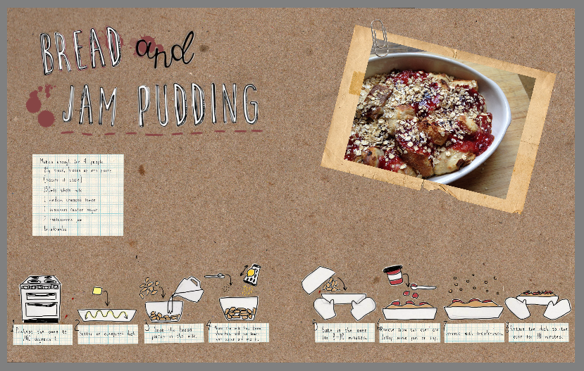
Illustrations were then made bigger so that they were more prominent on the page.


Mice characters were then added, on-keeping with the rustic, countryside feel. Illustrations are kept realistic so that they provide a point of reference to children and could potentially appeal to people of all ages.


Brambles and summer fruits were also incorporated to give the children an idea of where the jam comes from, and possibly inspire them to explore outside and pick their own fruit.

A fact about children picking fruit in the war was also included, providing context for the recipe and fruit illustrations. Torn, lined notebook paper incorporates another recognisable texture and continues the handmade feel.


More jam-coloured ink splatters were added, as well as mice paw prints and a tiny 'squeak' to give the mice a playful character and tie the double page spread together as a whole.
Wednesday, 6 May 2015
Blurb Text
"This is a collection of authentic recipes for the whole family to get involved in making, gathered in this book to commemorate the World War One centenary (it happened a hundred years ago!)
In an age before supermarkets, takeaways and fast food, cooking and baking skills were essential. Recipes were treasured by families and passed down through the generations.
These surviving recipes are a poignant, tangible snapshot of the way Britain used to dine at the beginning of the twentieth century, and can still be (thoroughly!) enjoyed today."
Subscribe to:
Posts (Atom)